Spring color ideas and palettes for walls and home accents are top of mind. As the days grow longer and the air fills with the scent of blooming flowers and a warmer breeze, it’s the perfect time to refresh your home with spring color ideas that embody the warmth and vibrancy of the new season. Whether you’re looking to make a bold statement or simply lighten up your space, the right hues can transform your home into a seasonal haven. Here are some warm, bright, and light color ideas to bring the essence of spring into your home.
1. Sunny Yellows
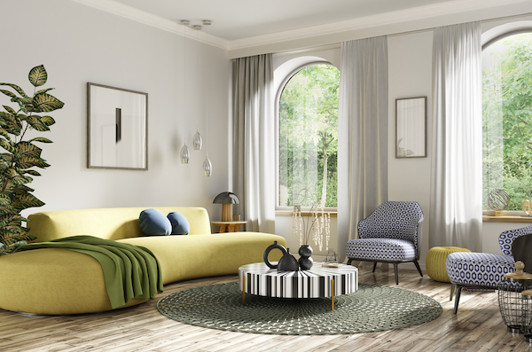
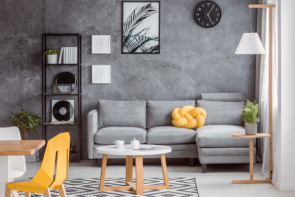
Nothing says spring like the cheerful glow of yellow. Shades like buttercream, goldenrod, and lemon can instantly brighten a room and create a warm, inviting atmosphere. Consider painting an accent wall, incorporating yellow throw pillows, or adding a sunflower-themed décor to infuse your home with a sense of sunshine. I recommend adding a bold colored piece of furniture as the focal point and build around that with softer hues that compliment. Yellow sofa with grey accent pieces is a perfect combination. Yellow will not only brighten your space and mood in the spring, but it will lift your spirits throughout the year, even when the winter months are shorter and gloomier.
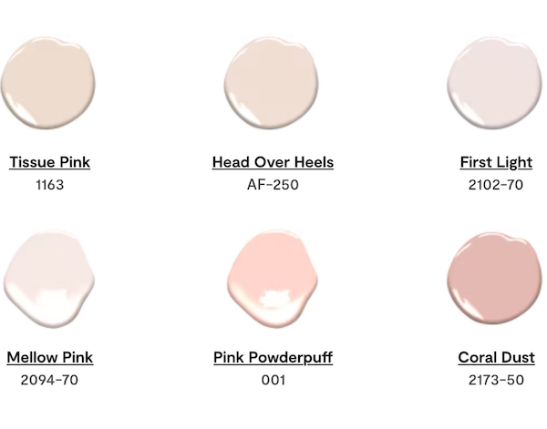
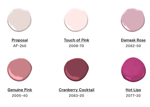
2. Soft Pastel Pinks
Pastel pinks like blush, peach, and rose quartz bring a touch of softness and elegance to any space. These hues work beautifully in bedrooms, living rooms, or even kitchens, offering a delicate warmth that pairs well with neutral tones like beige or soft gray. If you do not want the space to appear too feminine, you can incorporate small amounts of these beautiful pastels with floral arrangements, area rugs or throw pillows.
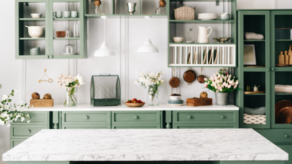
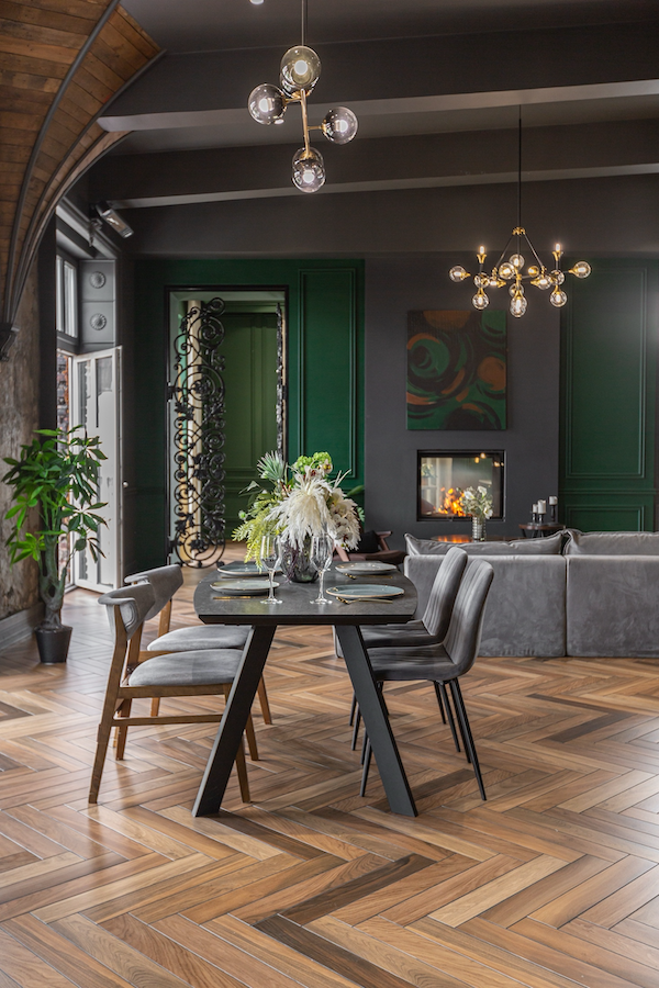
3. Fresh Greens
Green symbolizes renewal and growth, making it a perfect choice for spring. Select shades like sage, mint, or olive to create a fresh and natural ambiance. Whether through wall paint, furniture upholstery, or indoor plants, green can bring a revitalizing energy to your home. Green is the perfect accent color and stunning when paired with Grey and Gold. It is a perfect jewel tone for any space.
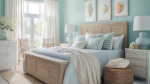
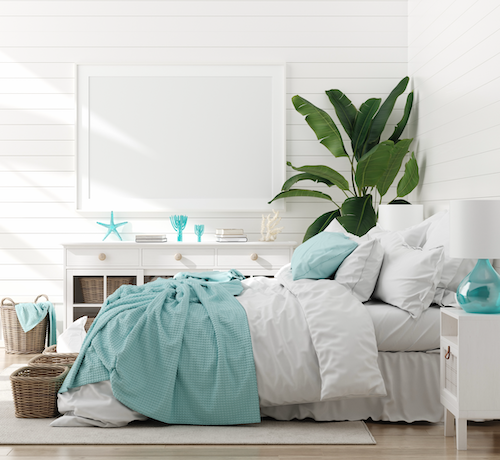
4. Sky Blues
The light and airy feel of sky blue can make any space feel open and serene. This color works particularly well in bathrooms and bedrooms, where a calming atmosphere is desired. Pair sky blue with white accents for a crisp, clean look that mimics the beauty of a clear spring sky. This can also be used as a calming coastal feel inspired by relaxed and natural beauty encompassed by airy and breezy summer days by the beach.
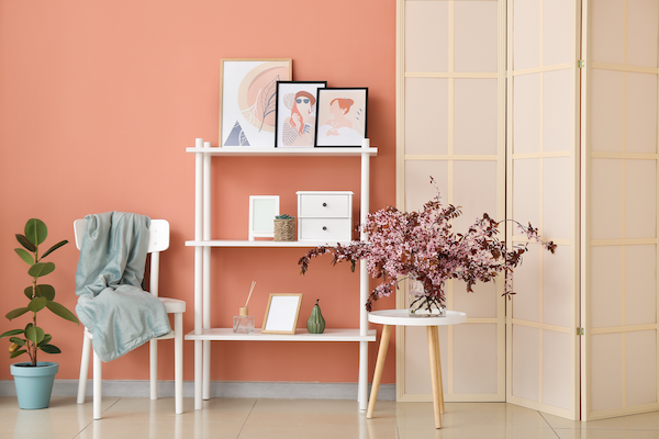
5. Warm Corals
A blend of pink and orange, coral adds both warmth and playfulness to a room. It’s an excellent choice for living spaces and dining areas where a lively yet cozy atmosphere is needed. Coral pairs beautifully with natural wood tones and creamy neutrals.
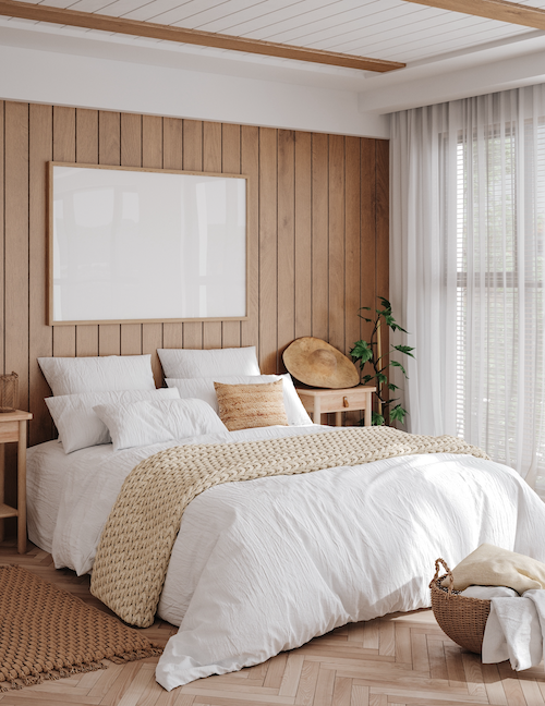
6. Crisp Whites and Creams
If you prefer a more subtle approach, consider layering different shades of white and cream. These colors reflect light beautifully, making rooms feel more spacious and airier. They also serve as the perfect backdrop for colorful accessories and floral arrangements.
Narrowing down your color choice is a challenging task. The number one question I get as a designer is how do you create a color palette with so many options? My answer is simple, go with the color you love most, and ask yourself does it fit into this space. Are you able to live with it? Can you create a palette in your home you’ll love to be in? There are no mistakes! You can always change your color choice. Experimenting is great. Here are some of the steps I recommend for color selection:
4 Steps for Choosing Colors
Step 1. Choose One Color You Love The Most, something that defines your style and inspires you.
Step 2. Add Highlights and Low-Lights that complement this color with accent pieces and different textures. Layering is key to create the perfect palette, adding depth and texture.
Step 3: Combine Both Cool and Warm Tones this helps neutralize the space and create a harmonious balance.
Step 4: Choose An Accent or complimentary color combination to define the space. We call it the 60-30-10 rule. The 60-30-10 rule is a design principle that suggests allocating 60% of a room’s color-to a dominant hue, 30% to a secondary color, and 10% to an accent color.
Final Touches
Once you’ve chosen your color palette, consider adding seasonal accents such as floral prints, lightweight fabrics, and natural materials like wicker or rattan to complete the springtime feel. Swapping out heavy winter textiles for breezy curtains and cotton throws can also enhance the lightness of your space.
Embracing warm, bright, and light colors this spring can breathe new life into your home, making it feel fresh, inviting, and full of seasonal charm. Which of these colors will you be incorporating into your space this season? Need help with your spring color palette? Contact Melanie Kokoros, Interior Designer and Owner at MDK Design Associates.